The Helix Collective
The logo design for the Helix Collective came about when Phil Popham (Executive and Artistic Director) and Dr. Sarah Robinson (Founding Member), approached High Arte about designing a logo for the Collective. When I asked what the Collective was, they directed me to their website where I learned:
Helix Collective is a Los Angeles-based ensemble that specializes in multi-media, collaborative performance and recording. Helix has released four critically acclaimed albums and has recorded the scores for over fifty films. The ensemble is at home in nightclubs and on the concert stage. Helix “has a little something for everyone: those who like their classics straight up, with a contemporary edge to it, or with populist appeal.” Called “dizzyingly virtuosic with exquisite musicianship and world-class range” by The Free Times and praised for their “beyond-the-ordinary programming,” the flexible instrumentation ensemble performs as a trio, quartet, a small chamber orchestra, and everything in between.
In addition, they pointed out the following:
Helix Collective is a 501(c)3 non-profit organization dedicated to creating a sustainable community of multi-disciplinary, multi-genre artists working together to create accessible, immersive works of art in order to bring joy, connection, solace, and understanding to a wide and diverse audience.
What I gathered from this was, they were interested in logo that could, in some way, capture what the Collective stood for – a group of talented individuals working together to create multi-disciplinary performances. They also wanted it to be colorful and not look like any other logos. They went on to say that they had reviewed a number of graphic designer’s websites and selected mine because they felt “I had a sense of humor,” which is true.
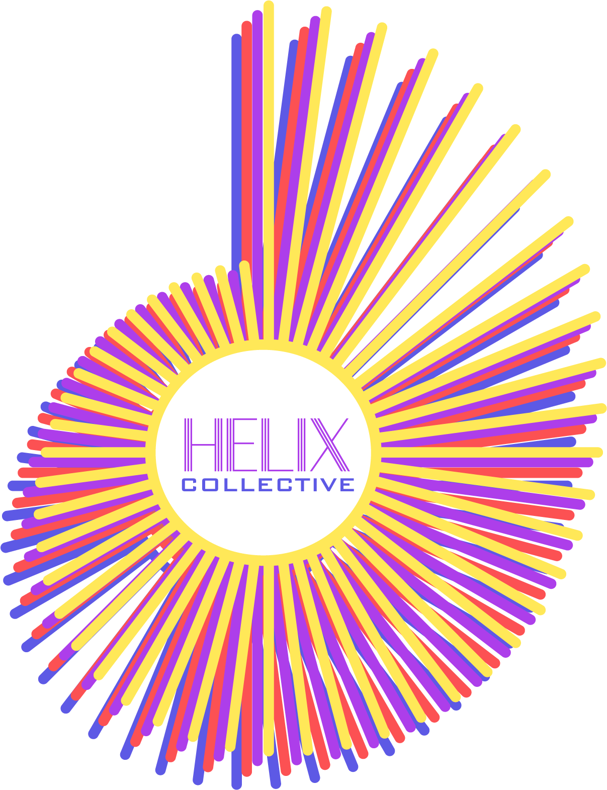
A Helix Logo
My Logo Design Brief: a coming together of colorful elements that create a bold statement, with, perhaps, a sense of humor.
I began my research by checking out what a Helix was. I was vaguely aware that the human genome was expressed as a helix spiral. While that particular design was not what I was looking for, it did present me with a variety of helix spirals and spiral variations. This included the one I selected, “radical lines in spiral helix shape”. Fortunately, my clients loved it. Now, all I had to do was to figure out how to spin this spiral into a logo.
I liked this form because the spokes visualized the idea of “many coming together to make one.” The fact that each spoke was a different length, confirmed the idea in my mind that this was a perfect representation of the Collective.
The Art of the Possible
After several ideas that didn’t pan out, I decided to overlay the helix with another helix and then another until they were stacked one on top of the other. I made each helix one of the colors my clients requested. By moving each helix slightly down and to the left, it created a striking design that was both boldly colorful and beautiful. “A happy accident,” one of my design instructors would say, but design is always about the possible. I felt this possibility expressed what my clients might be looking for and when I presented it to them, they were thrilled.
As for the name Helix Collective, I selected a font whose letters were composed of straight lines, reinforcing the design and perfect for Helix, and for Collective, a contrasting font. The colors for each flowed from the spiral colors.
Pulling it all together was simple because the name fit perfectly in the center of the helix. And so, the Helix Collective logo was born.